
One of the most important components of a successful company is a strong brand. Branding is integral to a business; it’s how you illustrate the company’s values to an audience at large. Branding takes an organization’s mission and makes it a visual asset. It requires detailed vision on the part of the founders — but also it requires a keen eye for design: someone who can take the idea and make it into a reality.
That’s where I come in. I’m Stephany Bradford, Creative Director for JANIIS, and I specialize in using design to increase a company’s value while communicating their ideas with accuracy and authenticity…aka: Branding.
Listening > Talking
When building a brand, my goal is to equip companies with design assets that both enhance and convey the service they represent. I find that when discussing a potential brand, non-designers often focus on the aesthetics first. It may come as a surprise that aesthetics actually come second. This is because aesthetics will fail without proper thought, research, analysis and genuine communication. Good designers ask A LOT of questions to get to the “why” behind a design — questions that go far beyond color choices and fonts. Knowing and understanding the hearts and minds of the client is crucial to providing an accurate brand. This priority actually made branding JANIIS easier. We’re in the same frame of mind: dedicated to listening to the experts of the industry and building off of that feedback.

When JANIIS CEO, Jason Hahn, came to me to equip JANIIS with a brand identity, he had the name, the colors, and a million good reasons for starting a business. He explained to me how JANIIS’s mission was to usher in simple, beautiful, and time-saving tools for an industry whose current processes are stuck in the past. He knew what to build, because he and Blake Leszczynski, our CMO, had spent months traveling to PMCs to listen to their pain points.
Again, listening — it’s so important.
He also explained that the name JANIIS came from the Roman God, Janus. Janus is the god of beginnings, gates, transitions, time, doorways, passages, and endings. He’s usually depicted as having two faces, looking simultaneously to both the future and the past. It made sense — JANIIS was looking to disrupt the future of an industry by learning from its past. Plus, property management naturally conjures up images of physical doors and gates, but I very much felt there was a deeper meaning. This platform would open the door to a whole new way of operating in the short term rental industry.
Creating The Logo
What brand is complete without a logo? A great logo is the catalyst to a new identity: one that celebrates history and heritage, inspires thought, and embodies the mission of the people it represents.
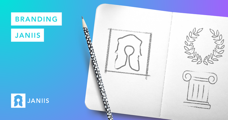
I definitely didn’t get it on the first try. Initially I wanted to pay homage to the two faces by creating an icon with reversed mirrored images. I also experimented with doors and passageways, as well as speech bubbles to illustrate communication. Below are some of my first sketches:

Those weren’t doing it for me though, so I went back to the Wacom tablet (a board you can literally draw on). Some of my favorite logos use negative space to give a deeper meaning to the function of the company. It’s actually pretty fun to try and spot — like the hidden arrow in the FedEx identity mark. The successful manipulation of negative space is something I love incorporating, so (obviously) I had to try.

After studying the Janus bust and sketching it out numerous times, I got attached to representing the actual roman god himself. To make sure I was really pushing the idea, I also made two lists of words. One that described the vacation rental industry as a whole, and another specifically about JANIIS. “Keyhole” appeared in both, and JANIIS believes that the key to building great products is listening. So, I positioned the negative space of the keyhole where Janus’ ears would be, and graphic design magic occurred!
I took this design step further and created a more illustrated, mascot version of the logo; one we could use internally or when we were showcasing our more creative/fun side. We love this bearded fellow so much, he even made it on the t-shirts we gave our team for Christmas.

Beyond The Logo

Type
Brand is more than just a logo though. There’s a need for supplementary elements that help set the tone for your company. One of them is type. Our (one and only) typeface is Avenir. Avenir is a geometric sans-serif typeface designed in 1988 by Adrian Frutiger. The name Avenir means “future” in French. It was designed to be a more humanistic version of traditional geometric typefaces like Futura. Seeing as how we’re all about the future, we thought it was a perfect choice for communicating to our audience.
Gradient
Another element I focused on was transitions. What better way to illustrate that then with a gradient? It artistically represents the transition of an industry into a new age of better software and better process…plus it’s just really gorgeous.
Bringing Roman Back
In our effort to pay homage to Roman history, I brought in actual Roman statues. What’s amazing is when you pair these historical figures with a sassy quip or pun, it completely changes their character. Continuing with the ancient roman theme, I began to think of marble and how we could make it our own. After playing around with the JANIIS purples, I ended up with a beautiful marble pattern. I also felt we’d be remiss if we didn’t incorporate the Roman laurel wreath. It’s typically worn on the head as a symbol of victory and honor, and we use it as a decorative element to “honor” our team members (#JANfam for life). Lastly, I brought in splashes of thick ink indicative of a Roman seal. I also like how it feels like paint in motion; wet paint on a fresh canvas really conveys the idea of creating something new. I see it as a nod to the creative process and our mission to continue to evolve our products.


In The Wild
When it’s all brought together, you get a brand that challenges the traditional; embraces the new; and even makes you laugh. As we make our mark in the short term rental industry by listening and creating, our industry will evolve. I’m thrilled to be a part of a company that not only allows for, but encourages that evolution, with one face on the past, and another on the future.